
Creams, warm neutrals, ochres, muted olives and deep teals pair best with Saltillo tile; these choices respond to the tile’s dominant orange-red to brown range and keep a room intentional rather than visually conflicted.
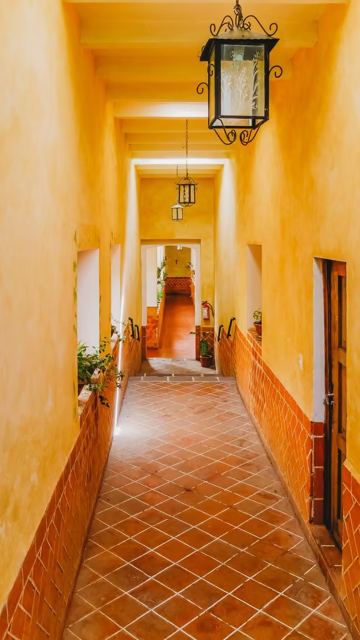
What Saltillo Tile Looks Like
Saltillo is handmade, unglazed terracotta that ranges from pale gold through red-orange to deep brown with strong tile-to-tile variation. That variation, often called movement, means the floor reads as a field of related tones rather than a single flat color, so successful palettes account for the tile’s lightness range, warm undertones and occasional manganese or charcoal streaks.
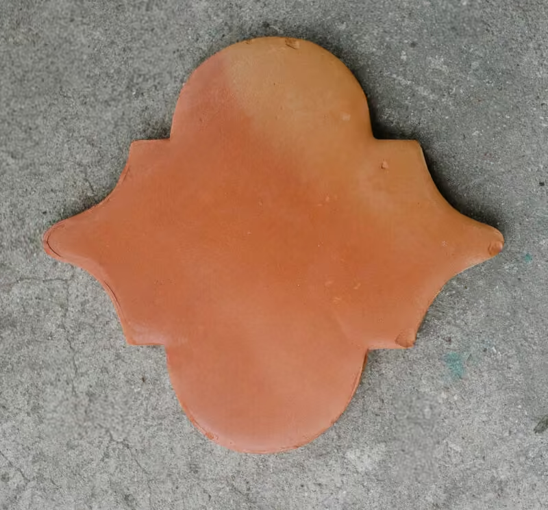
Warm Neutral Wall Colors
Choose warm cream, warm white, pale beige or a light warm greige to preserve brightness while letting the floor remain the focal plane. In low-light rooms select a higher-value neutral to avoid increasing contrast with the tile; this keeps walls readable without making the terracotta look dull or muddy.
Earthy Palettes That Create Cohesion
Analogous earth tones work predictably well: ochre and sandy tan tie to clay, while olive or sage green references surrounding vegetation and aged patinas. Use slightly grayed or desaturated versions to avoid visual buzzy saturation; these toned-down colors read as durable and integrate more predictably with wood stains and leather finishes.
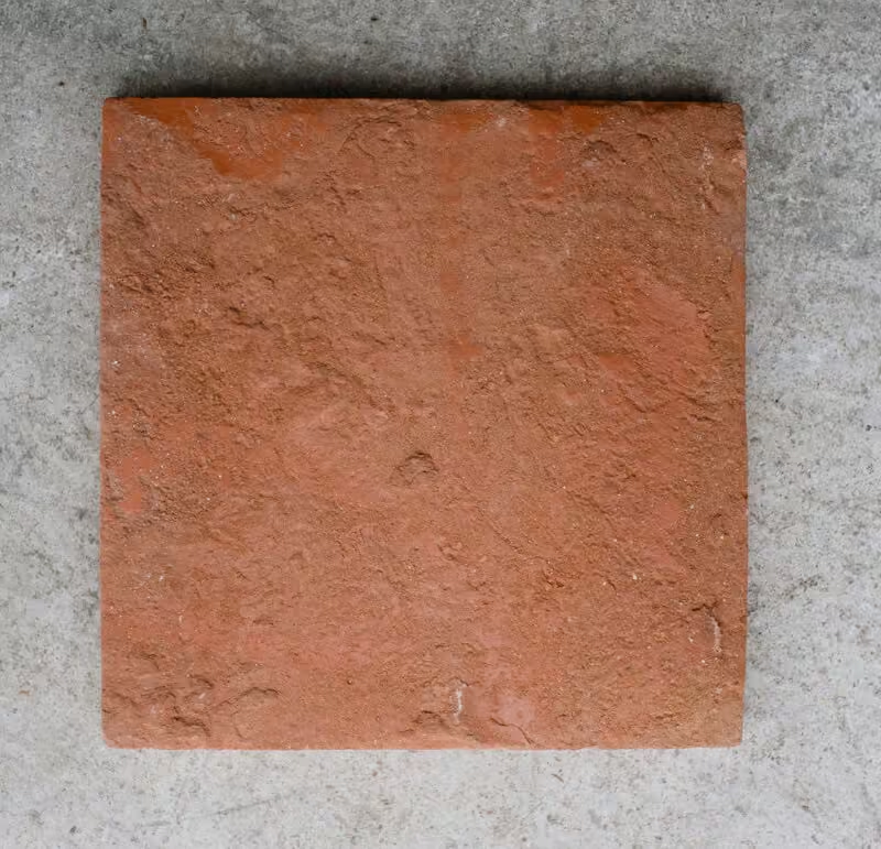
Blue, Teal and Green for Controlled Contrast
Deep blue, teal or emerald provide complementary contrast to Saltillo’s red-orange axis. Reserve these for accents, cabinetry, or a single feature wall so they anchor the scheme without competing with the tile’s texture. Darker manganese-toned Saltillo pairs best with richer jewel tones; paler Saltillo reads better with lighter, less saturated blues.
Grout, Trim and Ceiling Strategies
Match grout to a midtone found in the tile to visually connect field tiles and downplay grout lines. Choose warm off-white trim for crisp edges or a warm midtone trim when you need softer transitions. For ceilings, warm white prevents a cold top-of-room contrast that can make the floor appear redder by comparison.
How Light and Sealer Affect Color
Natural daylight enhances orange and red notes, while warm incandescent or LED sources push tiles toward brown and gold. Sealing deepens saturation and adds sheen; an unsealed matte finish reads more muted and more rustic. Always test sealer samples on a spare tile because the same sealer can darken some batches more than others.
Room-Specific Palettes and Placement Advice
Apply the following starter recommendations and then test on-site. Living rooms benefit from warm cream walls, olive textiles and teal accents with medium gray grout to stabilize the pattern. Kitchens work well with pale beige walls, a deep blue-green island and white or light-wood upper cabinets; warm under-cabinet lighting keeps the palette cohesive. For bathrooms keep walls light and use deep teal or charcoal vanities, plus a sealer and slip-resistant finish if water exposure is likely.
Durability, Maintenance and Safety Notes
Saltillo is porous unless sealed; use a tile supplier’s recommended sealer for kitchens and entryways and choose scrubbable wall paints nearby. Darker grout conceals soil but may show edge wear; lighter grout requires more frequent cleaning. Specify sealers and slip-resistance ratings when floors will be adjacent to wet zones or exterior thresholds.
Practical Testing Steps
Place 3 by 3 foot paint samples low on the wall and, when possible, on the floor to view in morning, midday and evening light with the room’s lamps. Add representative textiles and a wood-stain sample, then test the sealer on a spare tile and re-evaluate color interactions. For physical color sampling consider ordering Saltillo tile color samples on Amazon so you can compare swatches under your room lighting.
Accent Materials and Finishes
Introduce color with changeable elements such as cushions, rugs and art to preserve long-term flexibility. Medium-to-dark wood stains complement deeper tile tones. Choose aged brass or oil-rubbed bronze for hardware when you want warmth to read consistently next to terracotta; brushed nickel or chrome will create a cooler counterpoint that needs other cool accents to balance the room.
Local Sourcing and Sealer Guidance
Work with a supplier who handles Saltillo specifically because handmade batches vary and some sealers or grout systems work better with the clay used. For a local example of a Saltillo tile importer and practical product context see Talavera Studio: Saltillo and Mexican tile and decor, which illustrates how suppliers present color ranges and installation considerations.
Quick Decision Checklist
- Identify the dominant tile value and two common undertones in your installation before choosing paint.
- Test each paint and sealer sample in the room at multiple times of day, including under your planned artificial lighting.
- Match grout to a tile midtone for continuity; pick trim color to control edge contrast.
- Specify slip-resistance and a compatible sealer for wet or high-traffic areas.
Further Reading and Site Resources
For more detailed pairing strategies and related installation advice see the site’s practical guides on selecting color and tile. Start with the Architecture Adrenaline overview of Saltillo pairings at Colors That Go With Saltillo Tile. For grout selection principles applied to tile generally see What Color Grout To Use With White Tile. When planning a tile-based kitchen consult the site’s Choosing Kitchen Tile guide for moisture and layout considerations. For broader palette context that pairs with terracotta floors see Earthy Tones and Warm Neutrals.
Related Video
Saltillo tile is a versatile choice for flooring, bringing warmth and character to any space. To complement its earthy tones, consider pairing it with colors like deep turquoise, warm beige, or soft gray. These selections enhance the natural beauty of the tile, creating a harmonious look for your interiors.
More from Architecture Adrenaline
You can find more posts like this on our social channels, including ideas for enhancing your home. For more design inspiration, check out our Instagram page. We regularly share color palettes, design tips, and trends to help you with your projects.