Blue in light and blue in pigment are different: on a screen or stage you must emit blue wavelengths, while in paint or ink you usually mix cyan and magenta to produce a blue. This article gives precise mixing recipes, explains why mixes go muddy, and lists simple checks to ensure the blue you intend is the blue you get.
Additive Color and Blue Light
In additive systems blue is a primary produced by emitting photons at short visible wavelengths; you cannot mix red and green light to create a pure blue. For a clear reference on how additive systems differ from subtractive systems, see Additive and subtractive colour in color theory (LibreTexts). On screens, adjust perceived blue by changing its intensity or by adding neutral white to desaturate; display calibration is required when screen color must match print or paint.
Subtractive Mixing and Why Cyan Plus Magenta Works
In subtractive color, pigments remove light; mixing cyan and magenta absorbs red and green respectively and reflects blue. The Additive and subtractive colours on the colour wheel (RMIT) explains how cyan and magenta sit on the wheel and why their overlap appears blue. Choose a cool cyan and a cool magenta for the clearest mid blue; bias in either pigment shifts the result toward teal or violet.
How Pigment Bias Causes Muddy Results
Commercial pigments carry undertones. A magenta that contains red-yellow drift will introduce a yellow component when mixed with cyan, producing neutralization and a gray or brown result. The practical remedy is a split-primary palette: keep warm and cool versions of cyan, magenta and yellow so you can steer mixes without inadvertently adding the third primary.
Practical Recipes for Common Blues
Test every recipe on the actual substrate and under the project lighting. These are starting points, not absolute formulas.
- Clear mid blue: equal parts cool cyan + cool magenta; thin layers keep chroma high. For walls, add a touch of titanium white to create a pastel with stable undertone.
- Deep navy: start with ultramarine or phthalo blue; add up to 5 percent linseed-black or a very small amount of warm orange to darken without turning green.
- Teal/turquoise: cool cyan + small yellow; add white to shift toward soft turquoise for trim or cabinetry.
- Muted interior blue: mix blue with a neutral gray or a beige-tinted gray until perception reads as calm; avoid adding brown directly, which desaturates unpredictably.
Printing, Proofing, and CMYK Blues
Printed blues rely on controlled cyan and magenta separations and predictable dot gain. Specify a Pantone for color-critical work and obtain a hard press proof under the lighting in which the piece will be viewed. Paper whiteness and ink formulation can shift a blue toward purple or green; expect to revise CMYK ratios after the first proof.
Lighting, Finish, and Interior Perception
Color temperature and finish change how blue reads in a room. Cool daylight keeps blues vivid; 2700 K warm light shifts blues toward gray and muted tones. Gloss increases perceived saturation and highlights; matte reduces glare and softens chroma. Always test 4-inch samples on the wall and observe them at the room’s morning and evening light levels.
Quick Reference Table for Making Blue
| Context | How To Make Blue | Designer Note |
|---|---|---|
| Additive (light) | Use a blue-emitting source; alter intensity or add neutral white for tints. | Calibrate displays when matching digital color to paint or print. |
| Subtractive (paint/ink) | Mix cool cyan + cool magenta, or start from a named blue pigment and adjust. | Choose pigments with known undertones to control the final hue. |
| Printing (CMYK) | Use cyan + magenta with controlled ratios; add K for depth and to avoid oversaturation. | Request press proofs; paper and ink affect final saturation and hue. |
Common Mixing Mistakes and Practical Fixes
Do not assume tube labels indicate pure primaries. Phthalo blues dominate mixes and can overwhelm subtle tints; compensate with a neutral gray rather than adding more pigment. If a mix goes muddy, test each component alone to identify hidden yellow or orange undertones and replace the biased pigment with its cooler or warmer counterpart as needed.
Related Color Resources and Palettes
When pairing blue with materials, consider adjacent palettes and contrast ratios. For practical pairing suggestions with neutrals and warm materials, consult color pairing guides such as colors that go well with brown. For exterior uses where blue meets painted doors or trim, see recommendations for front-door colors for white houses and for contrasting brick settings consult front-door colors for red brick houses.
Checklist Before You Mix or Buy Blue Paint
- Is the application light-based or pigment-based?
- Will the blue need to remain saturated or be intentionally muted?
- What are the predominant viewing light temperatures and dayparts?
- Do your pigments have documented warm/cool biases? Swatch and compare.
- For print or high-precision work, can you supply a Pantone or receive a hard proof?
Conclusion. Use additive and subtractive principles to choose the correct workflow: treat screen color as emitted light and paint as reflected light driven by pigment bias. Test early, limit variables (substrate, lighting, pigment brand), and rely on proofs or sample swatches before making a final purchase or application.
Related Video
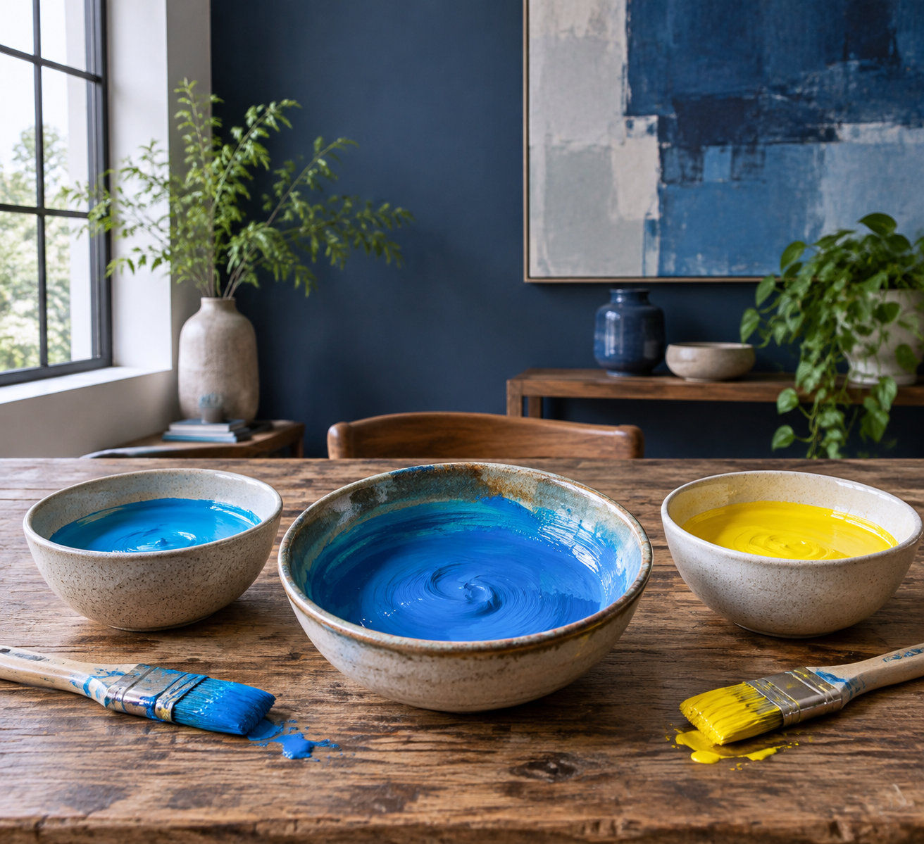
Understanding the components that create the color blue can enhance both artistic and design endeavors. By blending primary colors like yellow and cyan, one can achieve various shades of blue. Each mixture produces distinct hues, influencing everything from painting to interior design. When experimenting with color, it's crucial to approach mixing with intent, considering context and application.
More from Architecture Adrenaline
For insights into more color combinations and design techniques, be sure to check our social media channels. Follow us on Instagram for updates and inspiration.
Frequently Asked Questions
Can blue light be created by mixing other colors?
No, blue light is a primary color in additive systems. You cannot create pure blue by mixing red and green light. Instead, blue is produced by emitting blue wavelengths directly.
What is the difference between additive and subtractive color mixing?
Additive color mixing involves light and results in colors through the emission of light wavelengths. In contrast, subtractive mixing uses pigments to absorb light and reflect the desired colors, such as combining cyan and magenta to produce blue.
How do pigments affect the final shade of blue?
Pigments can introduce undertones that shift the resulting hue. For example, a magenta pigment with red-yellow undertones can produce a muddy mix with cyan, resulting in gray or brown. It's best to use cooler or warmer versions to achieve the intended color.
What factors influence how blue appears in a room?
Lighting temperature and finish significantly affect how blue appears in an interior space. Cool daylight enhances vividness, while warm light can mute the shade. Additionally, gloss finishes increase perceived saturation compared to matte finishes.