Discover the best colors that go well with brown! From teal to mustard yellow, learn how to elevate your style. Explore vibrant combinations now!
Colors that go well with brown unlock a world of warm, sophisticated palettes for fashion, interiors, and art. In this guide, you’ll find practical pairings, mood-led suggestions, and actionable tips to build cohesive looks that feel intentional rather than accidental.

Brown reads as a foundational neutral—rich, grounding, and incredibly adaptable. When you pair brown with the right hues, you amplify its warmth and depth while keeping the overall palette balanced. The key is understanding undertones: warm browns pair beautifully with other warm neutrals, earthy greens, and even bold accents that don’t overpower the space or outfit. Below, you’ll discover core pairing strategies that apply across interiors, fashion, and art.

Below is a concise reference table drawn from design guidance and editorials. It highlights common pairings, suggested uses, and the visual effect you can expect.
| Color Pairing | Best Uses | Effect |
|---|---|---|
| Cream | Interiors, Fashion | Cream softens brown, creating warmth and timeless appeal |
| Blue | Outfits, Accents | Offers a fresh, sophisticated contrast |
| Pink | Accessories, Decor | Lightens and softens brown with a gentle touch |
| Green | Nature-inspired palettes, Textiles | Enhances earthy vibes and a sense of freshness |
| Orange | Art, Highlights | Infuses energy and warmth with bold impact |
| Black | Fashion, Furniture | Introduces elegance, depth, and modern contrast |
| Gold | Decor, Fashion | Adds luxury, warmth, and opulence |
Brown spans a spectrum—from pale taupe to rich espresso. The shade you choose sets the tone for the entire palette. Lighter browns work well as neutral backdrops in interiors, creating a calm, versatile base. Darker browns anchor spaces or outfits, adding depth and sophistication. When pairing, ask: what mood do I want—soft and cozy, bold and modern, or earthy and natural?

Cool colors such as blues and certain greens provide crisp, contemporary contrast to brown. Consider these ideas to balance depth with serenity:
Warm hues naturally harmonize with brown, producing cozy, inviting spaces or outfits. Try:
Brown acts as a versatile base for varied looks. Practical styling ideas:
Brown serves as a grounding element in interiors. Use these strategies to achieve harmony:
Here are ready-to-use palette concepts that pair nicely with brown:
Color accuracy matters when you’re exporting, printing, or displaying brown-based palettes. Browsers typically render colors in sRGB, so if you’re seeing browns that look muddy or washed out in a gallery or on a screen, consider the color management workflow. Ensuring consistent color across devices, prints, and displays can prevent browns from shifting toward gray or muddy tones. Layer textures and materials—wood, textiles, metals—to reinforce warmth even when color precision varies.
To keep brown from feeling dull or muddy, watch for these pitfalls:
Quick answers about pairing colors with brown:
Brown is often overlooked in favor of flashier colors, but its versatility is remarkable. Its warm, earthy tones support a wide range of contexts—fashion, interiors, and art—when paired thoughtfully. The right color pairings unlock brown’s potential to feel modern, cozy, earthy, or luxurious, depending on how you combine them.
When exploring color combinations with brown, aim for the mood you want to convey. Here are common, designer-endorsed pairings and how to weave them into your plan:
Apply these pairings with space and purpose in mind. In a home office, a rich brown desk with soft blue accessories can inspire clarity, while a brown-and-cream combo creates a cozy reading nook that invites lingering.
Fashion lovers can explore a wealth of brown-centric combinations. Here are inventive styling ideas:
Turning brown into a vibrant color story is less about chasing new hues and more about texture, balance, and intention:
Brown can be a protagonist in your color narrative when paired with care. It supports a wide range of styles—from modern to rustic to luxurious. What are your go-to color combinations with brown? Share your favorites or a project you’re tackling, and let’s inspire each other!
If you’d like, I can export this article as a structured data file (JSON or CSV) with labeled sources and color suggestions, or tailor the palette recommendations for a specific use case like interior design, fashion styling, or branding. What would you like to explore next?
Have you experimented with brown in your own space or wardrobe? Share a photo or describe the palette you used and how it affected the mood—your experience could help others refine their brown storytelling.
To help you find perfect shades, consider picking up some Brown color palette paints and products to test and compare colors that complement brown in a practical, hands-on way.

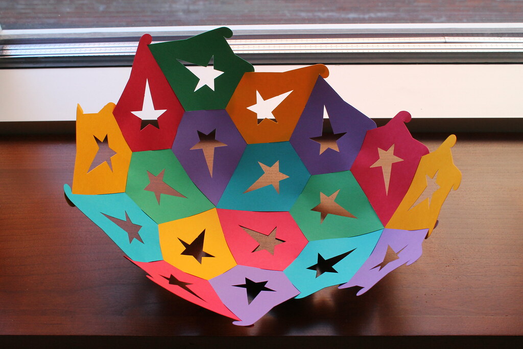
The images above are incorporated to illustrate color harmony and texture alongside brown. If any attribution is required beyond what is shown, or if licensing details differ, please provide guidance and I will update captions and credits accordingly.

A book that explores soulful interior ideas and mindful living, inviting readers to pair warm browns with complementary hues in a way that elevates living spaces. This purchase would appeal to shoppers seeking creative color inspiration and mood-setting guidance for brown-centric decor.
Best for: Best for Home Decor
Why pick this: Provides mood-boarding and color-pairing ideas that complement browns with warm or earthy tones, useful for readers seeking style inspiration beyond paint swatches.
Skip if: You are strictly shopping for color-mample products (e.g., paint, textiles, or tools) rather than decor inspiration.

This five-pan eyeshadow palette combines matte, shimmer, and metallic finishes in a compact form, offering versatile neutral-to-warm tones that pair nicely with brown shades for everyday to glam looks. It’s a budget-friendly choice for makeup enthusiasts exploring color coordination with brown.
Best for: Best Budget
Why pick this: An affordable way to experiment with complementary tones near browns without committing to higher-end products.
Skip if: You need a larger palette or specific high-pigment premium formulas for detailed eye looks.

This mauve-taupe plum matte single-eye shadow palette offers a compact option for creating soft, everyday looks with subtle plum accents that pair well with brown tones. It’s suited for makeup lovers seeking a petite, coordinated neutrals palette.
Best for: Best for Subtle Neutrals
Why pick this: A focused shade range that complements browns without overwhelming them, ideal for restrained makeup looks.
Skip if: You prefer multi-color palettes or glossy/shimmer finishes for bold color experiments.
When it comes to pairing colors with brown, the possibilities are endless! We’ve explored how stunning shades like teal, dusty pink, and mustard yellow can complement brown beautifully, transforming your space or outfit into something uniquely yours. Remember, the key is to find a balance that resonates with your style and the mood you want to create. So don’t be afraid to experiment with different combinations until you find the perfect match that speaks to you!
As you dive into the vibrant world of color combinations, remember that your choices reflect your personality. Whether you opt for earthy tones or bold pops of color, the right palette can elevate your surroundings. Want to keep up with more inspiration and design ideas? Be sure to follow us on Instagram, where we share all things design and aesthetics. Happy decorating, and may your color adventures be as exciting as they are beautiful!


