Great public spaces do more than look good in photographs. For this Architecture Adrenaline ranking, we looked for places that combine heavy public use, strong urban design, accessibility, landmark value, active programming, and adaptability over time. The result is a design-focused list of parks, plazas, waterfronts, markets, and civic districts that show how architecture and public life reinforce each other.
Quick Ranked Summary
- High Line, New York City - Elevated linear park
- Millennium Park, Chicago - Civic park and cultural plaza
- Granville Island, Vancouver - Market district and waterfront public realm
- Parc de la Villette, Paris - Cultural park
- Federation Square, Melbourne - Civic square and cultural precinct
- King's Cross public realm, London - Redeveloped rail-yard district
- Piazza del Duomo, Milan - Historic cathedral square
- The Bund, Shanghai - Waterfront promenade
- Plaza Mayor, Madrid - Historic urban square
- Superkilen, Copenhagen - Neighborhood park and urban design project
Why These Public Spaces Were Selected
This list prioritizes public use, urban design clarity, accessibility, landmark value, programming, adaptability, and the ability to teach useful design lessons. It is not a traffic-count ranking or a tourism popularity list. Each place was selected because it demonstrates a transferable idea: adaptive reuse, civic gathering, waterfront access, historic enclosure, market life, cultural programming, or neighborhood identity.
1. High Line, New York City
- City: New York City, United States
- Type: Elevated linear park
- Design lesson: Adaptive reuse can turn leftover infrastructure into a civic room when planting, access points, seating, and neighborhood edges are designed together.
- Caution: Its success also shows the need to plan for crowding, maintenance funding, and displacement pressure around high-profile public investments.
The High Line remains one of the clearest examples of infrastructure reuse becoming a public-space engine. Its elevated path gives visitors a new way to read Manhattan: not from a car lane or sidewalk, but from a planted promenade threaded through buildings. The strongest design move is the layering of wild planting, durable walking surfaces, overlooks, and frequent access points. That mix makes the space feel like both a park and an urban balcony. For homeowners and designers, the lesson is that circulation space can become memorable when it includes pauses, edges, texture, and a strong point of view.

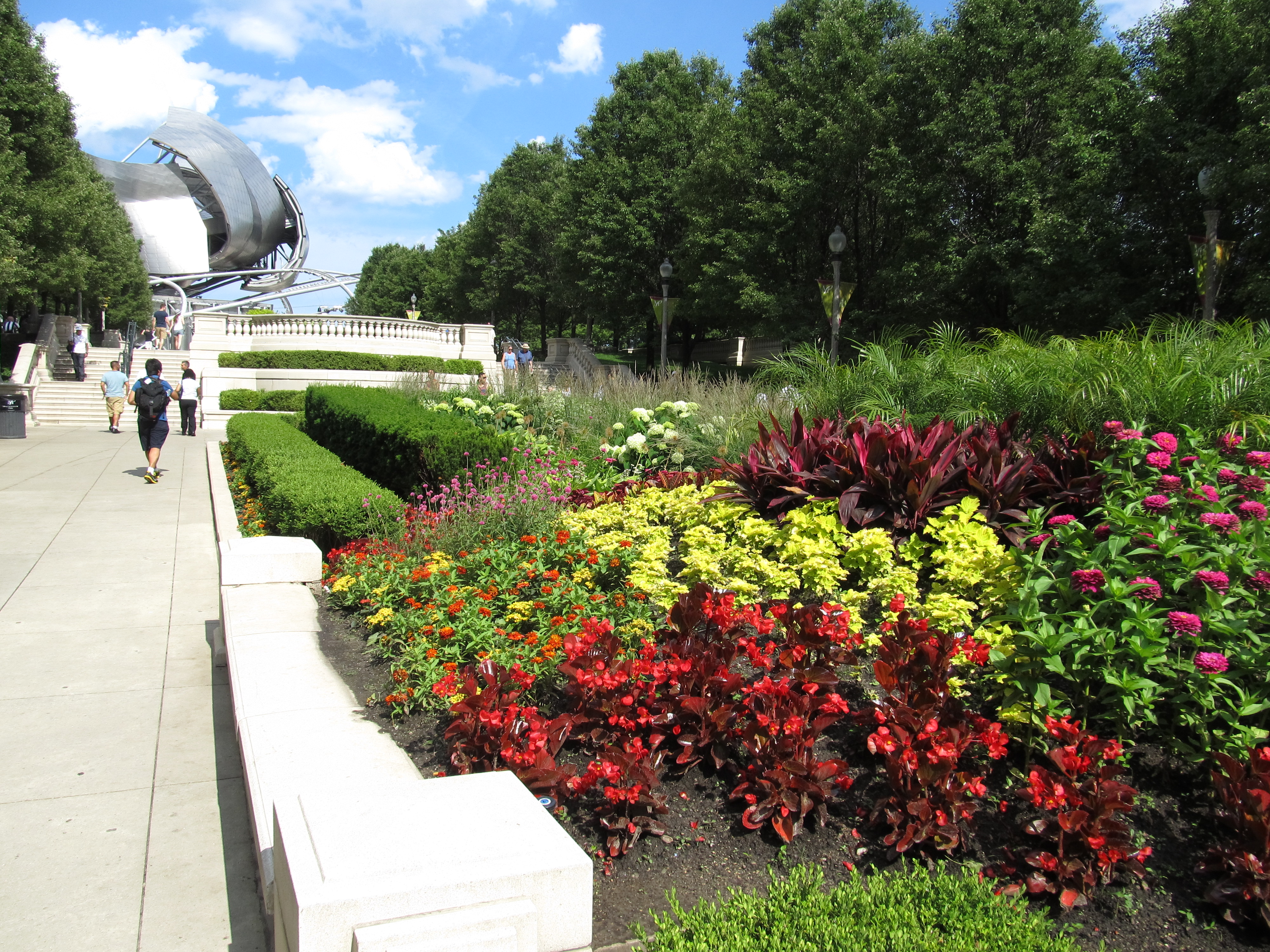
2. Millennium Park, Chicago
- City: Chicago, United States
- Type: Civic park and cultural plaza
- Design lesson: A public space becomes more magnetic when art, shade, performance, water, and clear circulation support different kinds of visits throughout the day.
- Caution: Large attractions require strong operations: surfaces, security, event logistics, and crowd routes have to be designed as seriously as the landmarks.
Millennium Park works because it compresses several civic experiences into one recognizable downtown landscape. Cloud Gate gives the park an instantly legible focal point, while the lawn, pavilion, gardens, and water features give people reasons to stay. The park also shows how contemporary materials can feel public rather than sterile when they are paired with generous programming. Its success depends on more than a photogenic sculpture; it is a system of paths, edges, views, and event infrastructure. The design lesson is to combine spectacle with practical comfort so the space serves both tourists and everyday users.
3. Granville Island, Vancouver
- City: Vancouver, Canada
- Type: Market district and waterfront public realm
- Design lesson: Markets, workshops, waterfront walks, and small-scale streets can make a district feel alive without relying on a single monument.
- Caution: Working public districts need careful tenant mix and service access so the authentic activity is not polished away.
Granville Island succeeds as a public place because it feels useful before it feels decorative. Markets, food stalls, studios, theaters, docks, and industrial remnants create a layered environment where visitors move between production and leisure. The waterfront setting gives the district a strong edge, but the smaller interior lanes make it explorable at a pedestrian pace. Instead of one grand gesture, its strength is the accumulation of active frontages and everyday reasons to return. It is a reminder that public space can be economic, cultural, and social at the same time.

4. Parc de la Villette, Paris
- City: Paris, France
- Type: Cultural park
- Design lesson: A large park can stay legible when it uses strong routes, recurring landmarks, and flexible lawns for cultural programming.
- Caution: Conceptual landscapes still need intuitive wayfinding and human-scaled places to sit, meet, and linger.
Parc de la Villette is influential because it treats the park as an urban framework rather than a purely pastoral escape. Its red follies, broad lawns, cultural venues, and paths create a field of activity that can absorb events, casual use, and institutional programming. The result is a public space that feels intentionally urban, not simply green. Its scale and conceptual clarity make it useful for thinking about campuses, waterfronts, and large redevelopment sites. The caution is that strong theory only works for the public when orientation, comfort, and daily use remain easy.

5. Federation Square, Melbourne
- City: Melbourne, Australia
- Type: Civic square and cultural precinct
- Design lesson: Civic squares need edges that hold activity: cultural buildings, food, events, transit access, and surfaces durable enough for constant use.
- Caution: Bold paving and angular architecture can divide opinion, so the public program has to keep proving the space useful.
Federation Square demonstrates how a civic plaza can become a city's everyday stage. Its angular architecture and patterned surfaces are visually assertive, but the reason it works is the density of uses around the square. Museums, restaurants, transit, public events, and outdoor screens keep the precinct active across different schedules. The space is not trying to be quiet; it is designed for gathering, watching, passing through, and returning. That makes it a useful case study in how architecture and programming must support each other.

6. King's Cross public realm, London
- City: London, United Kingdom
- Type: Redeveloped rail-yard district
- Design lesson: Redevelopment feels public when streets, squares, restored buildings, transit, water edges, and ground-floor uses are planned as one network.
- Caution: Privately managed public spaces need transparent rules so the district remains welcoming, not just polished.
King's Cross shows how a former industrial and rail landscape can become a connected urban district. Restored structures, new squares, canal edges, retail frontages, and cultural anchors create a sequence of public rooms rather than a single plaza. The public realm feels successful because movement is easy and there are multiple reasons to stop. Materials and scale help the new construction sit alongside older industrial fabric. The design takeaway is that adaptive urban districts need continuity: streets, edges, and open spaces should work together instead of competing for attention.

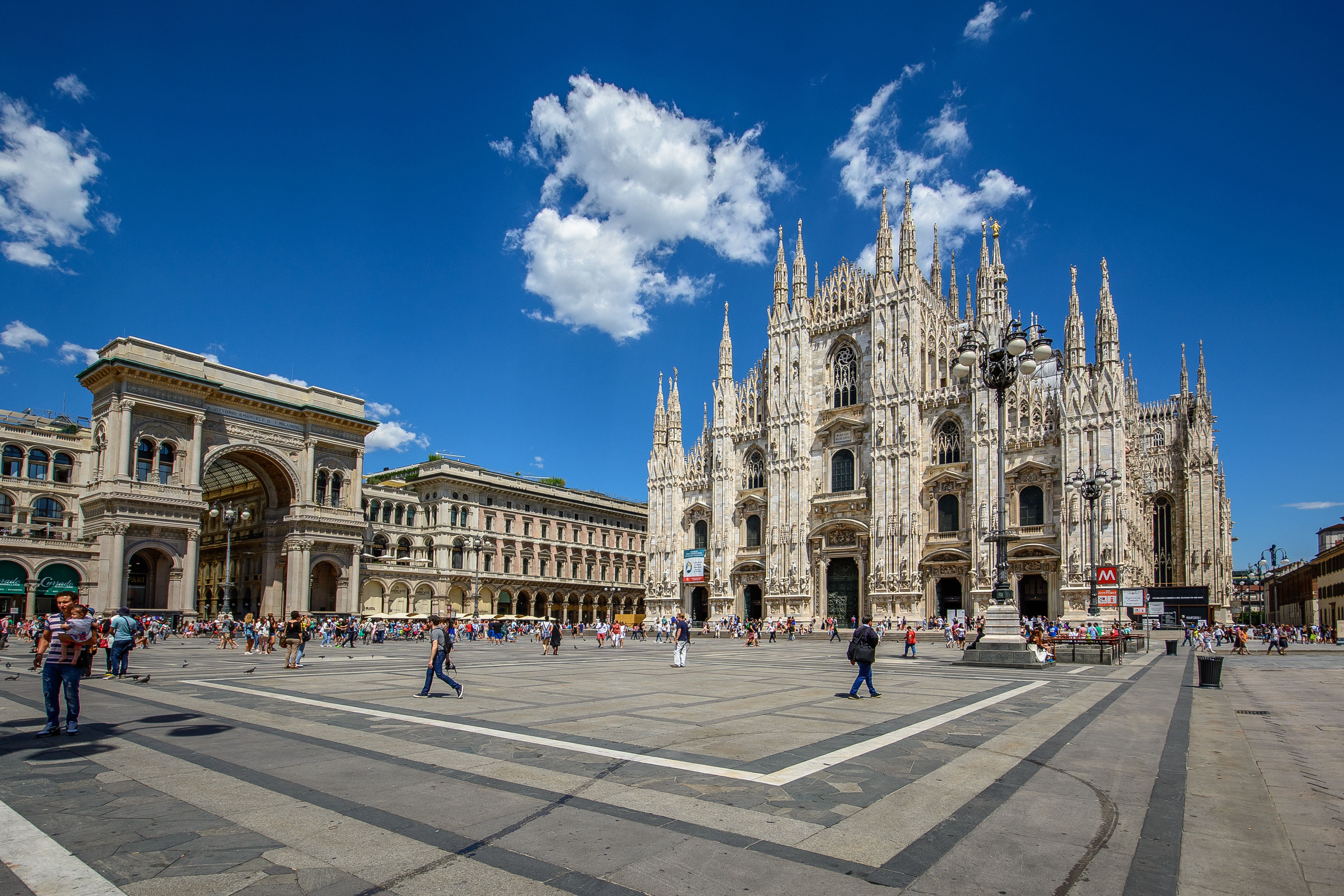
7. Piazza del Duomo, Milan
- City: Milan, Italy
- Type: Historic cathedral square
- Design lesson: A powerful civic space often depends on proportion, landmark orientation, and clear pedestrian space as much as decorative detail.
- Caution: Historic squares must balance tourism, preservation, access, and the needs of residents who use the center daily.
Piazza del Duomo works because the square gives Milan's cathedral enough civic breathing room to become a shared urban focus. The surrounding edges, arcades, transit access, and nearby commercial streets feed the space constantly. Its strength is not only the landmark itself but the way the open ground lets people gather, cross, look, and orient themselves. For designers, it is a lesson in scale and restraint: sometimes the most important public-space move is preserving a clear foreground. The square also shows how maintenance and crowd management become part of the design story in heavily visited historic places.
8. The Bund, Shanghai
- City: Shanghai, China
- Type: Waterfront promenade
- Design lesson: Waterfront promenades become memorable when they combine long views, generous walking space, skyline contrast, and frequent access points.
- Caution: Major waterfronts need shade, seating, crossing safety, and crowd capacity so the view does not become the only amenity.
The Bund is a public-space lesson in the power of edge conditions. Its promenade frames a dramatic contrast between historic architecture and the contemporary Pudong skyline across the river. The experience is simple but potent: walking, looking, photographing, meeting, and orienting along a continuous waterfront. The best waterfronts do more than provide scenery; they turn the edge of the city into a shared civic room. The Bund's popularity also underlines the need for careful crowd planning and pedestrian comfort along high-demand urban edges.

9. Plaza Mayor, Madrid
- City: Madrid, Spain
- Type: Historic urban square
- Design lesson: Consistent building edges, arcades, entries, and active ground floors can make a square feel enclosed without feeling closed.
- Caution: Highly commercial historic squares need active stewardship so public life is not reduced to restaurant seating and souvenirs.
Plaza Mayor is a classic example of how enclosure can make public life feel theatrical. Its regular facades and arcaded edges create a strong outdoor room, while entries from surrounding streets let the square stay connected to the city. The space supports strolling, dining, ceremonies, markets, and simple orientation. Its lesson is especially relevant for new town centers and mixed-use developments: a square needs edges that define it and uses that animate it. The caution is that tourist pressure can flatten local life if programming and management become too one-note.

10. Superkilen, Copenhagen
- City: Copenhagen, Denmark
- Type: Neighborhood park and urban design project
- Design lesson: Neighborhood public spaces can express identity through objects, color, routes, play, and local participation rather than monumentality.
- Caution: Symbolic design has to be backed by maintenance and community trust so it remains a shared asset over time.
Superkilen is memorable because it treats urban diversity as something visible in the landscape. Objects, colors, play areas, paths, and gathering zones create a park that feels specific to its neighborhood rather than generically polished. The project is often discussed for its graphic identity, but its deeper lesson is about participation and everyday use. Public space can carry stories when residents recognize themselves in the details. The caution is that symbolic richness still depends on upkeep, safety, and long-term neighborhood stewardship.

Related Architecture Adrenaline Reads
Frequently Asked Questions
What makes a public space successful?
The strongest public spaces combine comfort, access, identity, programming, clear edges, durable materials, and reasons for people to return at different times of day.
Why are some famous plazas not included?
This list is selective rather than exhaustive. It favors examples with clear design lessons across adaptive reuse, civic gathering, market life, waterfront access, and neighborhood identity.
Can these ideas apply to smaller projects?
Yes. Even a courtyard, campus path, mixed-use plaza, or pocket park can borrow these lessons: define edges, support movement, create places to pause, and plan for maintenance.