Discover how a monochromatic color scheme interior design can transform your space. Learn tips and tricks to create stunning, cohesive looks!
Monochromatic color scheme interior design unlocks a calm, cohesive, and sophisticated space by exploring variations of a single hue. In this guide, you’ll learn how to use tints, tones, and shades, combine textures and lighting for depth, and translate theory into practical steps you can apply in your home.

A monochromatic interior design relies on one color family, explored through different levels of lightness and intensity. This approach emphasizes harmony and sophistication, allowing you to focus on mood, texture, and light rather than juggling multiple hues. While the core color remains the same, you can subtly shift by using tints (lighter versions), tones (muted versions with gray), and shades (darker versions) of the chosen hue.
Monochromatic schemes can follow two primary paths, each offering a distinct visual effect:
Using multiple shades of a single hue softens the look and can make a room feel larger. Consider these practical moves:
Texture is the secret weapon in monochromatic design. Since color variation is limited, tactility and surface finishes carry the expressiveness. Combine:
Getting the undertone right is crucial. A cool gray with blue undertones can read as crisp and modern, while a warm gray with beige undertones feels cozy and inviting. The goal is to avoid dullness by selecting undertones that flatter your lighting and the room’s function. If a space reads flat, test swatches in natural light and at different times of day before committing.
The color wheel remains a helpful guide when planning a monochromatic interior. Use it to pair adjacent tones and ensure smooth transitions between light, mid, and dark variants. When in doubt, start with a dominant hue you love and map out a palette of at least three shades plus two textural accents to anchor the room.
Elevated monochromatic rooms often showcase a few key ideas: a restrained color family across walls, furniture, and textiles; a mix of materials (wood, stone, metal) within the same color range; and layers of soft lighting to sculpt mood. Designers frequently suggest trying monochromatic palettes in smaller spaces first—such as a bathroom or guest bedroom—to understand the feel before expanding to larger areas.

If you’re curious about bringing monochromatic design into your home, start small with a single room. Gather swatches, test in different lighting, and sketch a simple plan that includes wall color, furniture, textiles, and finishes. A cohesive monochromatic space is less about chasing a perfect shade and more about creating a deliberate, felt-in-space mood you love living in.
Ready to experiment with a monochromatic interior design? Explore different options by looking for monochromatic interior design color palettes that suit your style, and share your color story in the comments: what hue would you commit to, and which textures would you stack to bring it to life?
Embracing a monochromatic palette can be a game-changer for your home’s aesthetic. By using different shades, tints, and tones of a single color, you create a visually striking yet harmonious environment. The real beauty of this approach lies in its ability to simplify your design process while still making a bold statement. It's all about the emotional experience you want to evoke and how the color interacts with light and texture throughout the space.
Texture is paramount in a monochromatic scheme since it adds the essential element of interest that color variety might otherwise provide. Mixing textures invites a tactile experience that keeps the eye engaged. Consider these options:
Lighting plays a crucial role in how a monochromatic scheme is perceived. It can dramatically affect the way colors look at different times of the day and under various conditions. Utilize these strategies to maximize your palette:
A deep understanding of undertones will help refine your monochromatic design. A hue may vary widely in emotional resonance based on its undertones. For instance, you might find that a blue-gray exudes tranquility while a green-gray can feel fresh and lively. Test your color choices in natural light to determine if they maintain your desired feel throughout the day.
Beyond just aesthetics, texture in your monochromatic design can also manipulate how large or inviting a space feels. By mixing surfaces and fabrics, you create areas of interest that draw the eye and add layers to the room. Make it a point to:
The color wheel should be your best friend when choosing a monochromatic scheme. It helps ensure your shades flow naturally into one another, offering guidance on light, mid, and dark tones. Start by selecting a primary color and then explore variations that complement your vision for the space.
Many designers have found great success with monochromatic schemes in various settings. For instance, using a fresh green palette can create an invigorating kitchen while a serene taupe can promote a sense of calm in the bedroom. Don’t hesitate to seek inspiration from different design examples that showcase successful uses of a single hue across various textures and materials.

If you’re ready to embrace the richness of monochromatic design, start small—perhaps in a hallway or an alcove. Experiment with your chosen color's shades and textures, allowing your space to evolve organically. Remember, it’s about cultivating an atmosphere where you feel at home.

What colors are you drawn to for your space? Do you have a vision for how you might layer textures and light to bring your monochromatic ideas to life? Share your thoughts in the comments!
| Aspect | What to track | Why it matters |
|---|---|---|
| Core hue family | Main hue and tonal spine (e.g., blues; off-white family) | Sets the color story and ensures cohesive planning across surfaces and textiles. |
| Value and tonal range | Lightness differences across walls, furniture, and textiles | Creates depth and prevents a flat look while staying within one color family. |
| Texture and material variety | Fabrics, woods, metals, ceramics in the same hue family | Compensates for limited color variation with tactility and warmth. |
Research notes and practical guidance emphasize using a single color family while layering shades, textures, and lighting to control mood and perceived space. Key ideas include testing undertones in natural light, balancing ambient and accent elements, and harnessing material variety to add depth without introducing new hues. When in doubt, start small and let the color story evolve with your lighting and furnishings.
Ready to experiment with a monochromatic interior design? Share your color story in the comments: what hue would you commit to, and which textures would you stack to bring it to life?


The Pocket Complete Color Harmony is a compact reference that gathers thousands of color palettes and practical guidance for applying monochromatic and harmonious schemes in interior design. It’s ideal for designers, students, or DIY enthusiasts looking to quickly access cohesive palettes that work across walls, textiles, and accents.
Best for: Best Overall
Why pick this: Provides a vast library of color palettes with practical guidance tailored to interior design, making it easy to achieve a cohesive monochromatic look.
Skip if: You need detailed furniture specs or price comparisons in the same listing.
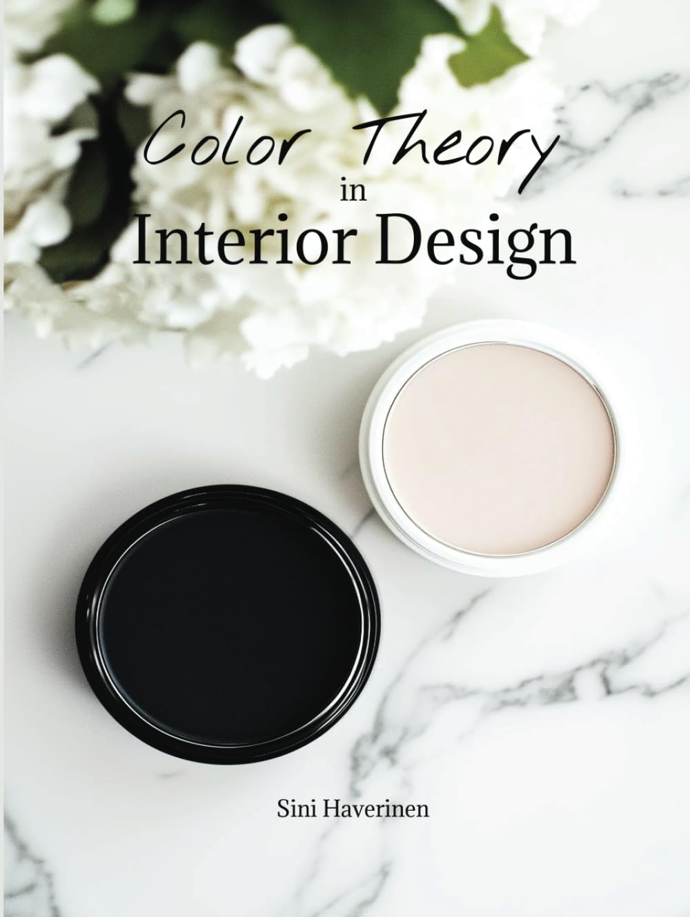
Color theory in interior design is a primer that explains how hues, tones, and contrasts influence space perception and mood. This guide-style product is suited for beginners exploring monochrome strategies and how to pair neutrals with accent tones in walls, textiles, and décor.
Best for: Best for Beginners
Why pick this: Simplifies monochromatic design concepts, helping readers understand how to build cohesive rooms from color theory fundamentals.
Skip if: You need high-end design project references or advanced color grading techniques.

The Color Scheme Bible compiles ready-to-use palettes and descriptive examples to guide stylish monochrome approaches across rooms. This resource is helpful for homeowners and interior hobbyists who want practical, actionable color plans that translate into furniture and textiles choices.
Best for: Best Value
Why pick this: Delivers multiple monochromatic-inspired palettes that are easy to apply to walls, furnishings, and decor accents, offering budget-friendly design inspiration.
Skip if: You need in-depth architectural guidance or large-format reference visuals.
As we wrap up our exploration of monochromatic color scheme interior design, I hope you feel inspired to give your spaces a fresh and cohesive look. Embracing a single color in varying shades can truly transform a room, creating everything from serene retreats to bold statements. Whether you go for soft pastels or deep jewel tones, the key is to play with texture and materials to keep things interesting. Trust me, the results can be stunning!
If you’re eager to dive deeper into the world of interior design and find more inspiration, make sure to follow along on our journey! We love sharing tips, tricks, and visuals that spark creativity. You can check out our latest projects and ideas on Instagram. I'm excited to see how you incorporate monochromatic schemes into your own homes!


