
Apple Store interior design is characterized by a thoughtful blend of aesthetics and functionality that transforms the shopping experience into something truly memorable. With design principles originating from the flagship SoHo location, Apple stores showcase how daylight, material honesty, and seamless user navigation can create welcoming spaces that encourage interaction and exploration. Interestingly, the emphasis on tactile engagement means that shoppers are not just passive observers; instead, they are invited to connect with products in a way that feels natural and intuitive.
Elements of Apple Store Design that Inspire Retail Excellence
- Integration of daylight and open sightlines for an inviting atmosphere
- Use of durable yet warm materials to promote touch and engagement
- Carefully planned visitor journeys that enhance the shopping experience
- Signature elements, such as glass cores, that maintain brand coherence
- Local adaptations of a unified design philosophy to resonate with different markets
As you delve deeper into this exploration of Apple Store interior design, you'll discover actionable strategies that can enhance your own retail space, allowing you to harness the principles of clarity, interaction, and premium quality that have made Apple's approach so iconic.

Apple’s flagship interiors distill clarity, accessibility, and product-led storytelling into a calm, hands-on shopping experience. The opening arc is defined by daylight, tactile materials, and restrained display systems that invite touch without visual clutter, delivering a workflow that guides visitors from entry to product, service, and support seamlessly.

How the design language translates into everyday retail spaces
Core decisions revolve around legible materiality, open sightlines, and a calibrated material palette that communicates premium quality while remaining durable in high-traffic environments. Glass, wood, stone, and metal surfaces are chosen not for show but for their ability to withstand daily use while maintaining a soft, human feel. Lighting avoids glare and hotspots, instead sculpting ambient and task illumination that lets devices read clearly at arm’s length.

Signature design cues across flagship interiors
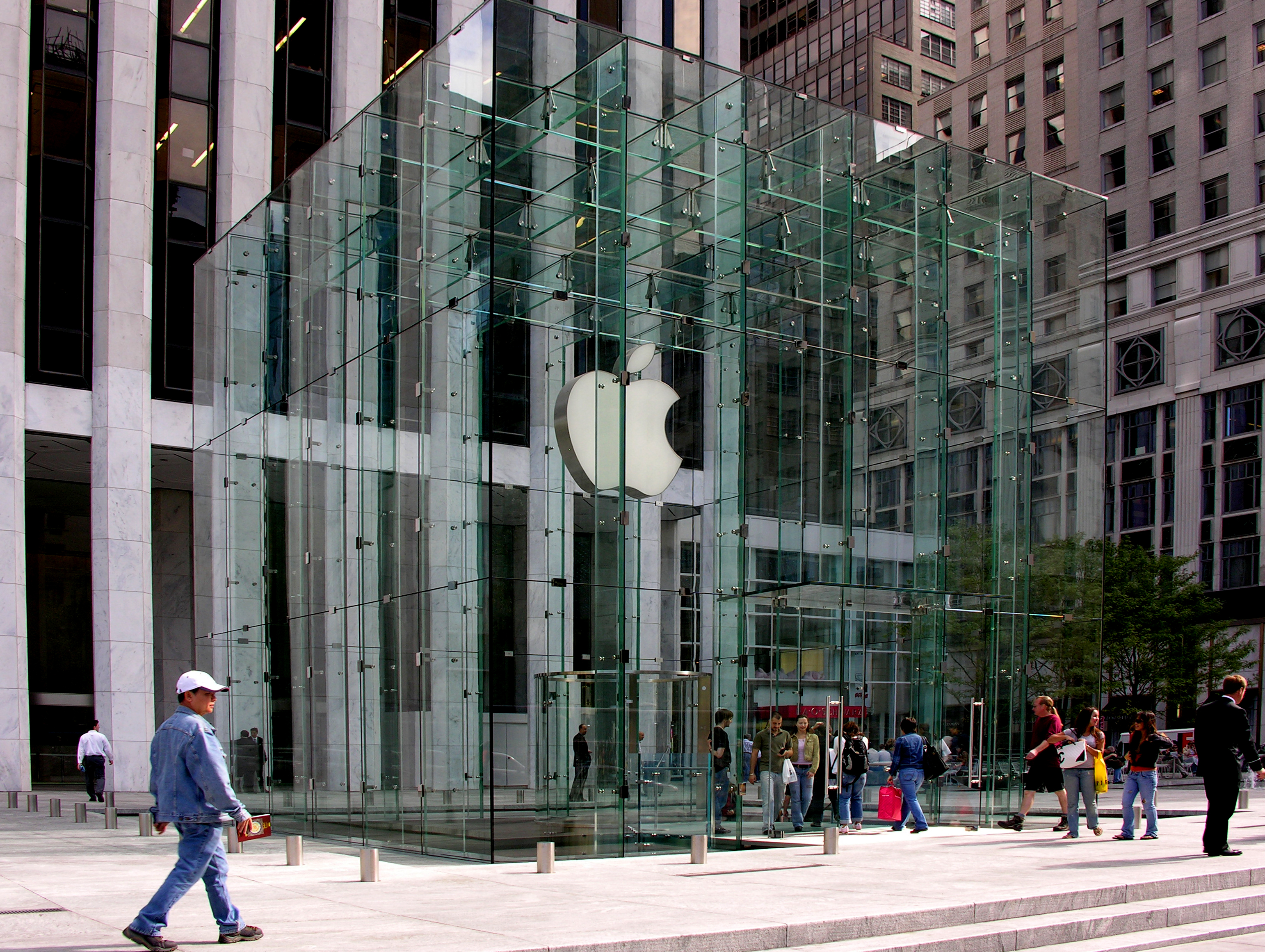
Recurring motifs—such as transparent circulation cores, cantilevered display platforms, and skylights—establish recognizable wayfinding without shouting. These features function as quiet anchors to the shopper’s journey, allowing product narratives to take center stage while maintaining a human-scale sense of warmth and tactility that counters showroom austerity.
The SoHo origin story and its influence on retail architecture
Transforming a former post office into a two-story destination, the SoHo flagship demonstrated how daylight, a dramatic but restrained stair, and a pedestrian-scale bridge can shape perception. The collaboration with Bohlin Cywinski Jackson introduced a humane, daylight-rich environment where materials take precedence over overt branding, a formula many stores have since adapted in varied urban and suburban contexts.
Material strategy that encourages touch and discovery
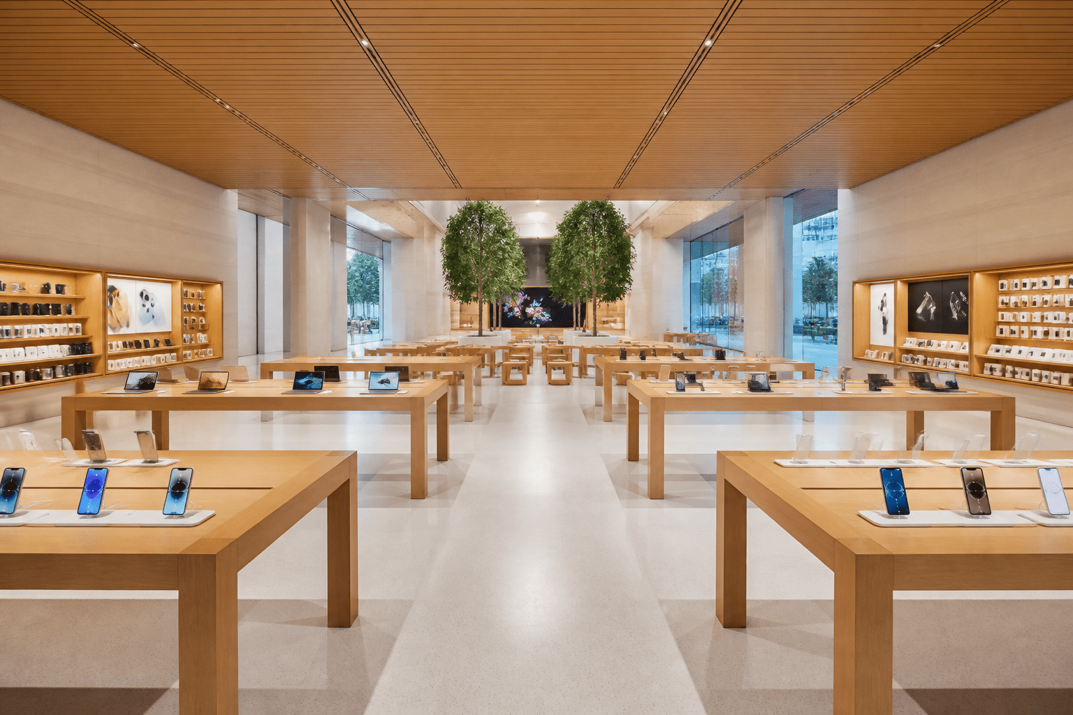
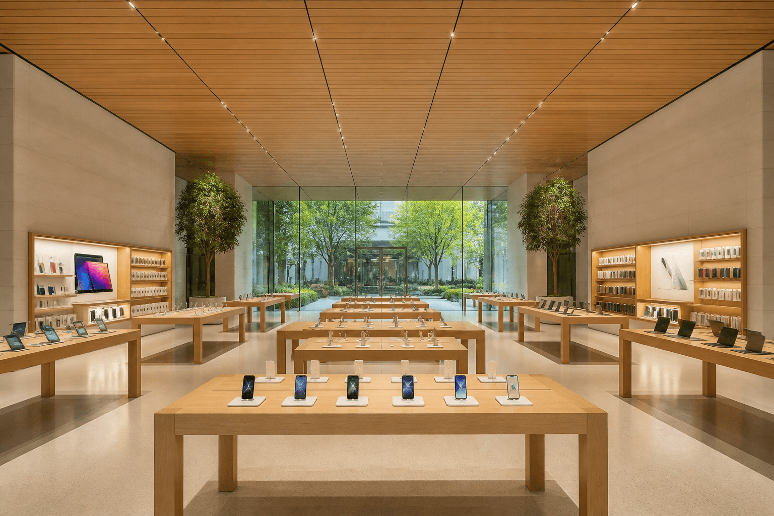
Recent iterations broaden the material vocabulary to include warmer woods, curved forms, and softer lighting. The aim is to invite tactile interaction with devices while preserving a calm, curated atmosphere. This evolution supports longer shopper engagement and deeper comprehension of product capabilities, without sacrificing premium clarity.

Planning a visitor journey that feels effortless
Effective layouts map a clear sequence—entrance, product zones, services, and assistance—while maintaining generous sightlines to device walls. Service areas are placed for easy access but designed to minimize disruption to the primary product experience, enabling help to be available when needed without interrupting exploration.
Milestones that shaped the current interior narrative
Highlights such as the Tysons Corner relocation and the SoHo flagship set benchmarks for how material honesty, service flow, and daylight-driven environments can adapt to different contexts. The Tysons Corner refresh in 2023 underscored a transition toward natural materials and a more inviting, still-brand-consistent aesthetic.
Global variations within a unified design philosophy
Despite a consistent core—clarity, human-centric materials, and experiential focus—stores tailor the language to local conditions. Some emphasize expansive lounges and open seating, while others foreground service zones or sculptural features that respond to street context. The result is a cohesive family resemblance with regionally tuned details.
Actionable steps to translate Apple-inspired design into a retail project
Design teams can apply concrete practices that stay faithful to the philosophy while addressing practical constraints:
- Define a precise guest-journey arc from entry to product engagement and aftercare.
- Specify warm, durable materials (wooden walls, stone accents, glass interfaces) to convey tactility and longevity.
- Calibrate lighting to highlight devices without glare, using layering of ambient, task, and accent light.
- Preserve unobstructed sightlines to keep product storytelling at the forefront.
- Position service zones for easy access but design them to integrate with the primary display landscape.
Key considerations and clarifications about the approach
Distinctive questions often arise around how much openness is appropriate for your brand. The answer hinges on balancing customer flow with product focus: too much openness can dilute product impact; too much partitioning can hinder discovery. Material choices should be guided by durability, maintenance needs, and the climate of the store location, ensuring that textures remain legible and inviting over time.
What to explore next for practitioners and leaders
For designers and retailers, the next steps include studying flagship case studies, interviewing practitioners involved in these interiors, and examining material specification guides—always with a view to translating the core principles into a local context while preserving the brand’s architectural language.
| Aspect | Practical Translation | Illustrative Example |
|---|---|---|
| Material language | Choose warm, durable materials that read as premium yet approachable; mix wood, stone, glass, and metal with careful proportioning. | Tysons Corner interior reimagined with wood walls and glass-display cores. |
| Circulation and sightlines | Plan intuitive routes that reveal product groupings and services from multiple entry angles. | Open stair and visible device walls guiding the eye through the space. |
| Iconic features | Incorporate signature elements—glass cores, skylights, and controlled daylight—as navigational landmarks. | SoHo’s two-story glass circulation core as a recognizable spine. |
Product recommendations for a commercial-retail design aesthetic
To surface furniture and fixtures that align with Apple store-inspired interiors, consider carefully chosen pieces and materials that emphasize tactility, durability, and quiet elegance.
Amazon search results for Apple store interior design furniture offer a range of options—from timber veneer display surfaces to low-profile metal framing and glass showcases—that can be adapted for retail environments seeking a refined, product-led atmosphere. Use these recommendations to inform decisions about display heights, finish continuity, and seating that supports extended visits without overpowering the product narrative.
Reader engagement: share your experiences
Have you tested Apple-inspired concepts in a retail or hospitality setting? Share which materials, lighting strategies, or layout choices most effectively balanced product emphasis with human comfort, and how local constraints shaped your approach.


1
Shop Different: How Retail Revealed Apple's Genius

Shop Different chronicles how Apple's retail spaces have shaped modern store design, offering insights into architecture, layout, and experiential concepts that influence visitor flow and brand storytelling.
Best for: Interior designers and store planners researching iconic retail environments and Apple-inspired layouts
Why pick this: The book focuses on retail design concepts exemplified by Apple, useful for designers seeking brand-driven store experiences.
Skip if: You need technical construction details or up-to-date product specs not typical for design-history books.
2
Contemporary Retail Design: A Store Planner's Handbook

This handbook provides guidance for planning and detailing contemporary retail interiors, with a focus on layout strategies, circulation, and space utilization for modern stores.
Best for: Store planners and interior designers evaluating store layout and space planning fundamentals
Why pick this: Emphasizes practical planning approaches that can translate to real-world Apple-store-style spaces.
Skip if: You need case studies limited to Apple-branded stores or current construction specs.
3
The Big Book of Retail Design: Everything You Need to Know About Designing a Store

The Big Book of Retail Design compiles foundational concepts for designing stores, including floor plans, merchandising layouts, and customer flow considerations relevant to flagship spaces and concept stores.
Best for: Designers researching broad, practical retail-design guidance suitable for large or conceptual stores
Why pick this: Offers a wide overview of retail-design components that can inform Apple-store-inspired interiors.
Skip if: You need in-depth brand-specific case studies or Apple-exclusive design details.
How Apple Builds Its Stores:
As we’ve explored the unique and captivating elements that define Apple store interiors, it’s clear that every detail plays a role in creating a seamless experience for customers. From the minimalist design to the ingenious use of natural light, Apple has masterfully blended aesthetics and function. The next time you step into an Apple store, take a moment to appreciate how each aspect contributes to the inviting atmosphere, making technology feel more accessible than ever.
Stay Connected and Inspired
If you’re as fascinated by innovative design as I am, I encourage you to keep exploring and stay updated on more great content by following our journey on social media! Check us out on Instagram for the latest inspirations and insights into the world of architecture and design. Let's continue to appreciate how well-designed spaces, like Apple stores, can enhance our experiences and encourage us to connect with the brands we love.


