If you are wondering what color paint is best for your hallway, high-LRV neutrals like soft whites and pale greiges are your best bet. These shades not only brighten poorly lit spaces but also enhance the overall aesthetic and functionality of your home. Did you know that a well-chosen hallway color can significantly improve wayfinding and even influence the vibe of your adjacent rooms? Choosing the right tone is essential for creating an inviting and cohesive atmosphere. In this post, we'll delve into specific strategies and actionable steps to help you select the perfect color for your hallway, ensuring it becomes a stunning pathway rather than a neglected corridor.
With these foundational concepts in mind, let's explore how different colors and finishes can transform your hallway into a space that feels expansive and welcoming while reflecting your personal style.
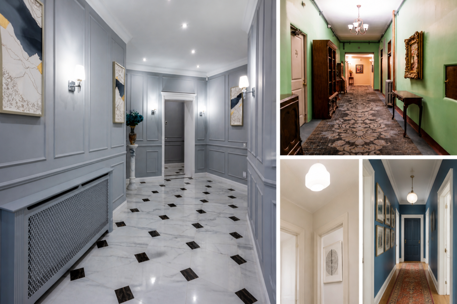
The hallway colour that immediately brightens a dim, narrow corridor is a high-LRV neutral—typically a soft white or pale greige that reflects more daylight and reduces visual compression. This choice matters because it sets the tone for adjacent rooms, improves wayfinding through consistent contrast, and influences maintenance needs in high-traffic passages. In this guide, you’ll find precise, testable guidance on LRVs, finishes, lighting, and practical steps to achieve a welcoming hallway you can rely on in daily life.
| Aspect | What It Means For Your Hallway | Practical Tip |
|---|---|---|
| Light Reflectance Value (LRV) | Represents how much light a colour reflects; higher LRVs brighten spaces, lower LRVs add depth. | For dark or north-facing hallways, opt for higher-LRV neutrals to maximize brightness. |
| Lighting | Natural daylight and artificial light change how colour reads on walls throughout the day. | Test paint samples in the actual hallway under your planned lighting plan before committing. |
| Finish/Sheen | Satin or eggshell diffuses light differently from flat or matte finishes, affecting perceived brightness and durability. | Choose an easy-to-clean finish (eggshell/satin) for high-traffic areas while preserving good light diffusion. |
Color strategy for hallways isn’t abstract: projects such as Philadelphia's Fresh Paint project at F.S. Edmonds demonstrate how fresh, well-chosen colour refreshes can transform public-facing corridors, guiding movement and improving perceived safety through brighter, cohesive palettes. Similarly, campus-scale refreshes like the UC Riverside Physics Building interior refresh reveal how colour schemes and lighting choices are coordinated to enhance wayfinding, readability, and acoustical comfort in public spaces. When you translate those lessons to a home hallway, emphasize high-reflectance neutrals on walls, crisp ceiling whiteness, and a durable, washable finish for longevity. For a practical product reference, see color-swatch testing with hallway-friendly finishes such as eggshell or satin, which balance brightness with durability.
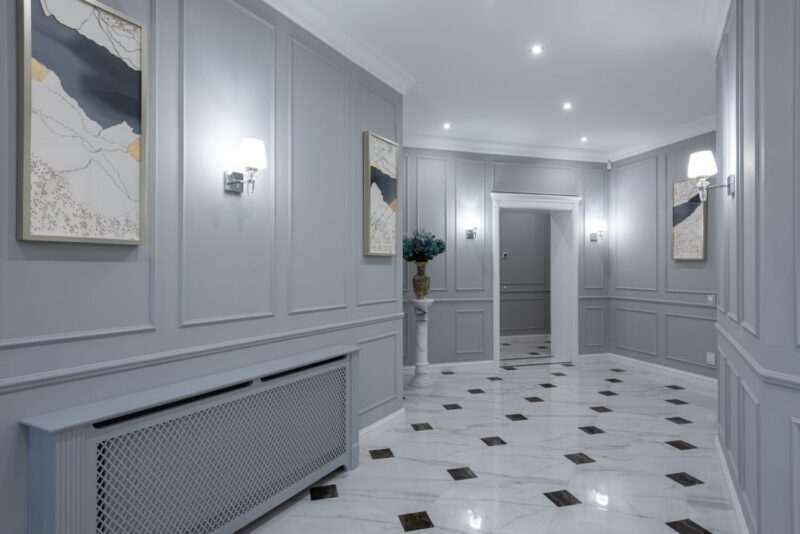
For readers who want a tangible shopping path, consider starting with color swatches and samples you can apply directly in the hallway under actual lighting. A practical way to preview options is to order hallway paint color samples and compare them in situ before committing to a full can. See how a light neutral interacts with trim, flooring, and door hardware across different times of day.
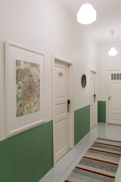
The following sections translate theory into steps you can apply immediately, including how lighting, LRVs, and finishes interact to influence brightness and readability in your hallways.
When you ask what colour to paint a hallway, light neutrals, warm whites, and soft greiges consistently read as open and inviting. If the corridor is narrow or north-facing, prioritize shades with higher reflectivity; in brighter, wider halls, you can experiment with slightly deeper neutrals for gentle contrast. See how white and near-white schemes read in real spaces such as the referenced public and educational projects above to calibrate expectations against your home’s daylight.
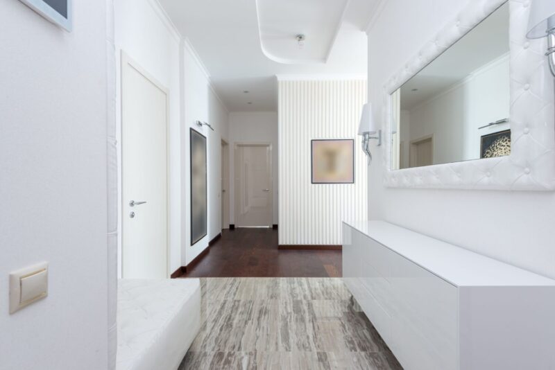
Begin with the degree of daylight, hallway width, and the mood you want to evoke. Pale neutrals amplify openness, while warmer neutrals contribute coziness when paired with bright trim and controlled shadows. If you want a guiding principle, choose a single main wall colour and a complementary trim, then test under daylight and your planned artificial lighting to confirm undertones remain calm rather than pronounced.
A near-neutral with mid-to-high LRV often performs best because it harmonizes with adjacent rooms and lighting conditions. Whites, off-whites, and light greiges are common, with warmer beiges offering subtle warmth. Always verify daylight direction to anticipate undertones at different times of day.
Maximise brightness by selecting high-LRV neutrals or warm whites. Consider pale taupe or ivory in a light finish; if you want a hint of colour, keep it airy with a very light tint rather than a saturated hue. Visual tricks such as a lighter ceiling and strategic wall-art placement can amplify perceived space without sacrificing colour discipline.
A unified palette across hallways and landings supports seamless movement. Use a light wall with slightly deeper trim to delineate edges, and reserve a single well-placed artwork or a soft accent wall to add interest without breaking the visual flow.
Brighten by selecting a colour in the 60–80 LRV range, then pair with a bright ceiling and layered lighting to avoid cavernous effects. Warm whites or pale greiges paired with luminous trim read as more expansive than cool-toned neutrals in the same range.
Pick a high-LRV neutral from a trusted paint family and augment with ample, layered lighting. Crisp white trim helps edges remain legible, while slightly warm undertones prevent the space from feeling clinical.
Grey walls partner well with crisp whites, warm woods, and accents in blush, soft blue, or sage. Maintain light ceilings and a light trim to preserve airiness and readability of architectural details.
Highlight architectural lines by using a shade that contrasts slightly with the adjacent walls. A near-neutral wall with contrasting trim can draw attention to the stairs, while a deeper wall colour on the stairs, balanced with lighting and artwork, creates drama without sacrificing readability.
In compact corridors, creamy whites or pale greiges work well. Use mirrors and well-planned lighting; painting the ceiling the same shade as walls visually extends the space and increases perceived brightness.
Keep wall colours lighter than the trim to preserve legibility and keep wood features as a design accent. A soft white, cream, or greige maintains brightness while letting the dark trim read as a deliberate, architectural feature.
The entry colour sets the home’s initial mood. Opt for bright neutrals or warm tones that welcome visitors while ensuring a smooth transition into the corridor. If you crave chroma, apply a restrained, muted hue that doesn’t clash with spaces beyond the entry.
In bright or well-lit hallways, light neutrals perform best. Greige shades offer warmth without muddiness, while pale beiges preserve an inviting atmosphere. A restrained accent wall or trim in a complementary shade can introduce personality without overpowering the space.
Map daylight hours, review lighting plans, consider floor color and door/woodwork, test colours in situ, verify LRVs, and decide on a trim strategy before purchasing multiple cans. This disciplined approach helps ensure the hue remains harmonious with adjoining finishes and avoids costly redos.
For concrete hues with proven brightness behavior, start with neutrals and greiges that read well in varying daylight. If uncertain, sample a warm white, a mid-toned greige, and a near-white with a cooler undertone to observe how each reads in your hallway’s daylight and artificial lighting.
Before purchasing, select a primary wall colour, a trim option, and an optional accent. Decide on a finish strategy that balances durability and light diffusion, then test samples in the hallway under daylight and your planned lighting. If you’d like, I can tailor 2–3 concrete colour options with LRVs and finishes based on your hallway’s size, light, and style, and provide a printable testing plan.
There is no universal best colour for every hallway. The ideal choice balances light, scale, and adjacency to other spaces. Start with light neutrals to maximize brightness, then layer warmth or contrast with trim or a restrained accent. If you’d like, share details about your hallway’s dimensions, lighting, and surrounding spaces, and I’ll propose 2–3 specifically tailored colour options with LRVs and finish recommendations.
Would you like a practical in-situ testing plan for your hallway, including suggested patch sizes, finishing options, and a week-by-week testing schedule using colours such as Shoji White, Winter Walk, Natural Linen, and Drift of Mist? I’m happy to map that out for you and adapt to your lighting and flooring choices.
Are you ready to start your hallway makeover now? Tell me about your space in the comments, and share photos if you can. I’d love to hear what works for you, what you tried, and what color you’d pick next to keep your home feeling bright and connected.
For further reading and practical reference, explore White Hallway: Brighten Up Your Home's Aesthetic, Narrow Hallway Decor Ideas, and Flat Vs Eggshell: Choosing the Right Paint Finish to see how these principles translate into published, editor-tested guidance. If you’re curious about broader palette strategies, the article Whole-House Paint Colors: Choosing the Perfect Palette provides a larger framework for coordinating colours throughout a home.
Readers may also reference practical colour-testing resources such as hallway paint color samples when planning their in-situ comparisons and finish testing.
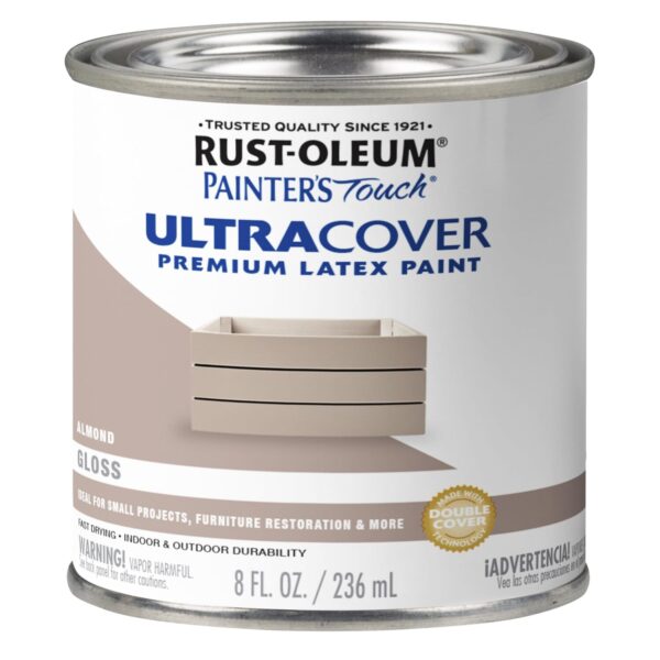
Rust-Oleum Painter's Touch Ultra Cover Enamel is a gloss almond enamel paint designed for interior or exterior use on multiple surfaces, including metal and wood. Its fast-drying formula makes it a practical choice for hallway touch-ups or small projecs where quick turnaround matters. The enamel finish provides durability and color that can help a hallway feel more defined and cohesive with other trim or doors.
Best for: Homeowners wanting a durable, glossy finish on multiple hallway surfaces (walls, trim, and doors) with a quick-dry option
Why pick this: Versatile enamel with fast drying suitable for busy hallways that need a durable gloss finish.
Skip if: You require a water-based low-odor formula or a matte finish.
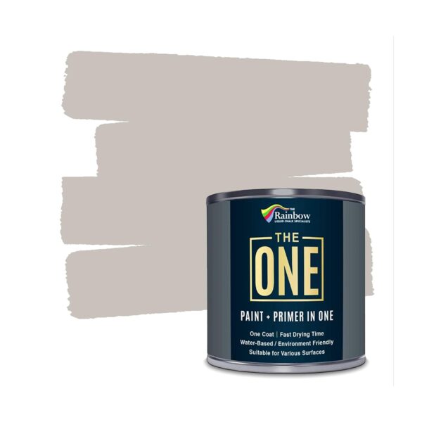
THE ONE All-In-One Paint & Primer is a soft taupe matte finish paint with one-coat formula. It’s designed for easy indoor and outdoor decorating on walls, floors, and furniture, and emphasizes a water-based, low-VOC profile. This makes it a practical option for hallway projects where a uniform, contemporary taupe tone can suit various design styles with minimal steps.
Best for: Quick hallway makeover with a single-coat, matte finish in a versatile taupe tone
Why pick this: Simplifies color projects by combining paint and primer in one step, reducing setup time.
Skip if: You need a glossy or high-sheen finish for hallways with more reflective trim.
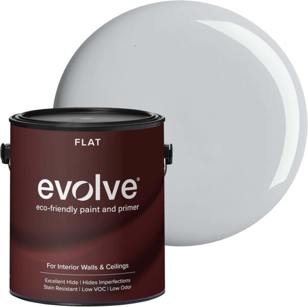
EVOLVE Interior Paint & Primer in flat silver gray is a one-gallon option that claims excellent hide and low-VOC, low-odor performance. It’s suitable for large hallway areas where a neutral, non-reflective surface may be desirable, and its washable interior paint finish can be practical for high-traffic corridors.
Best for: Hallways needing a soft, neutral backdrop with low odor during application
Why pick this: Low odor and low-VOC formula suitable for enclosed hallway spaces.
Skip if: You require a glossy or satin finish for more light-reflective hallways.
Choosing the right paint color for your hallway can truly transform the space, making it feel warm and inviting or airy and fresh. Whether you’re leaning towards a bold statement or a subtle backdrop, remember that the color will influence how your hallway feels every day. Don't hesitate to grab some sample swatches and see how different colors interact with the light in your hallway at different times of the day. Trust your instincts and pick what speaks to you—you want this space to reflect your personal style.
Once you've settled on a color and revamp your hallway, don't forget to share your transformation journey! Also, if you're looking for more inspiration, tips, or ideas, be sure to check out our latest projects on Instagram. We love connecting with fellow design enthusiasts, and who knows? Your hallway makeover might inspire someone else's project!